I’m Shannae Edgar, a recent Graphic Design graduate & born Illustrator. As a child-like creative and natural storyteller I have a deep passion for creating highly expressive work with the hopes of connecting with an equally passionate audience. I have completed several graphic design qualifications as well as 2 years of experience working in the industry; 1 year working in print & the other working digitally. I have a well rounded skill-set but take special interest in Illustration and Branding. I now have plans of going on to pursue a career as a freelance creative.
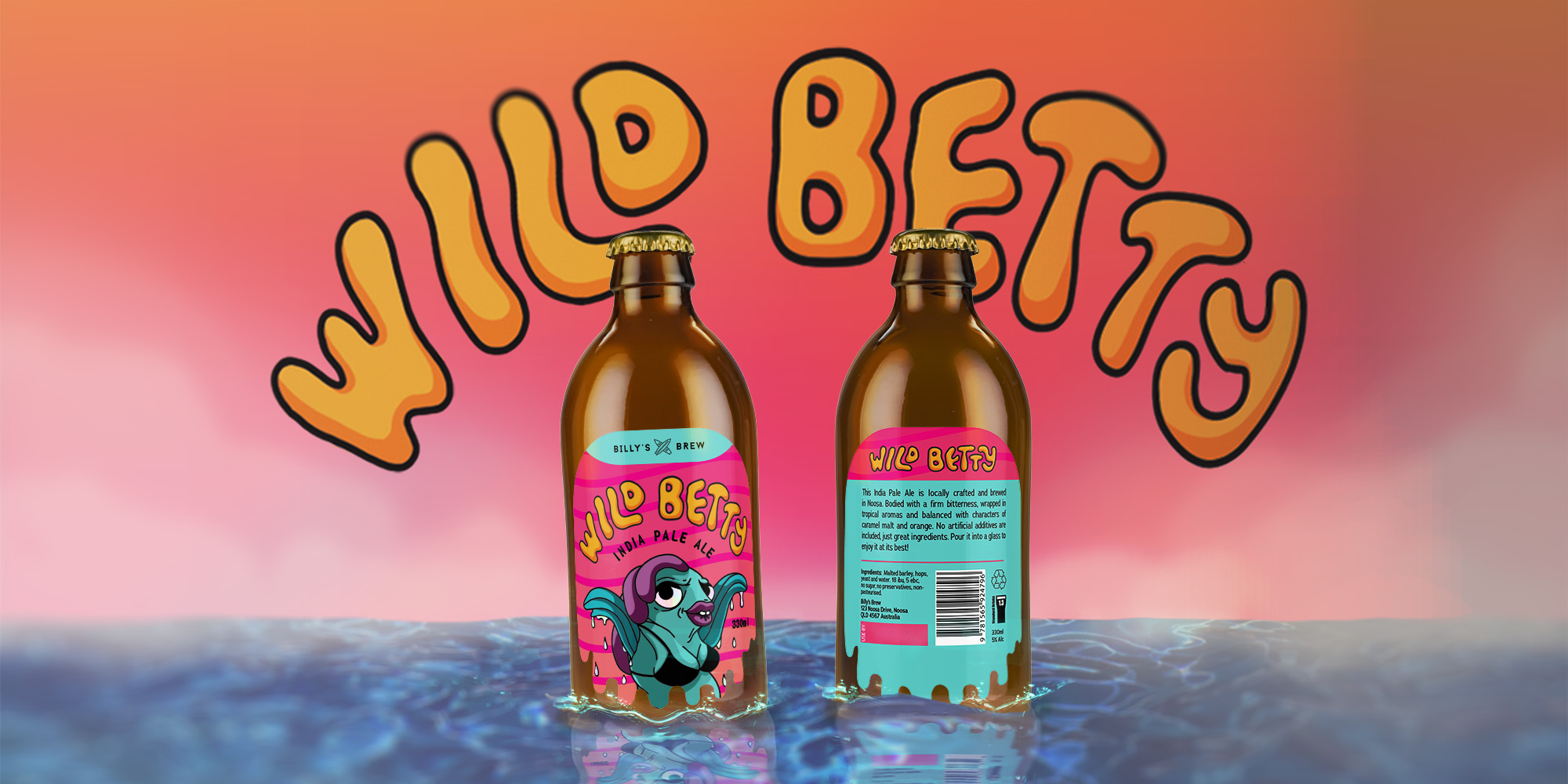
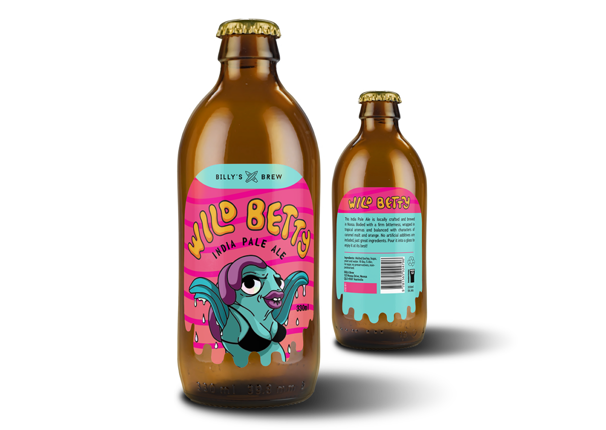
Wild Betty is a project that I completed as an assessment for my diploma. Billy’s Brew is coastal craft beer company, driven by the philosophy that beer is for sharing. With the upcoming launch of their tantalising new IPA brew “Wild Betty” and being given a full scope of creative freedom, I was asked to produce the product packaging design. The big challenge to overcome for this project was being able to deliver something that would stand out in an over-saturated market. The deliverables included print-ready artwork files for both the front and back label that should include a die-cut and embellishment.
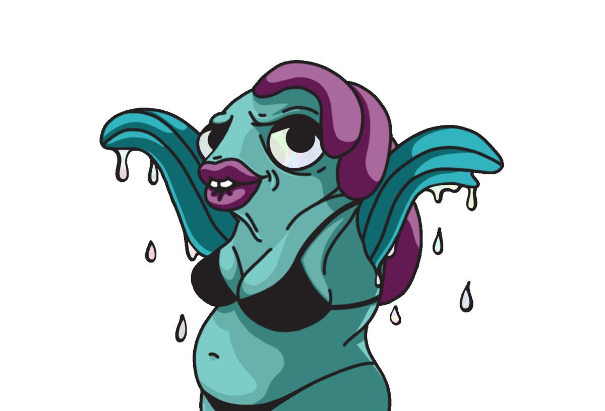
By taking inspiration from psychedelic, surf-rock art styles I developed my Wild Betty concept around a character I designed. My character embodies the coastal lifestyle by representing the reckless surfer chick that everyone wants to crack a beer with. This colourful and rebellious style allows my design to stand out on the shelves and attract a younger, rowdy audience.
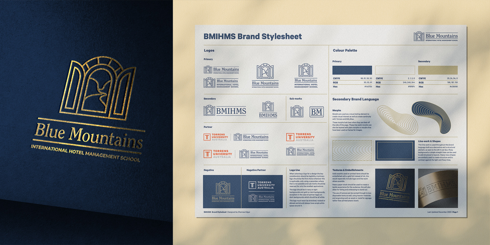
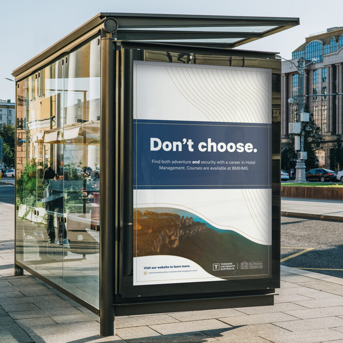
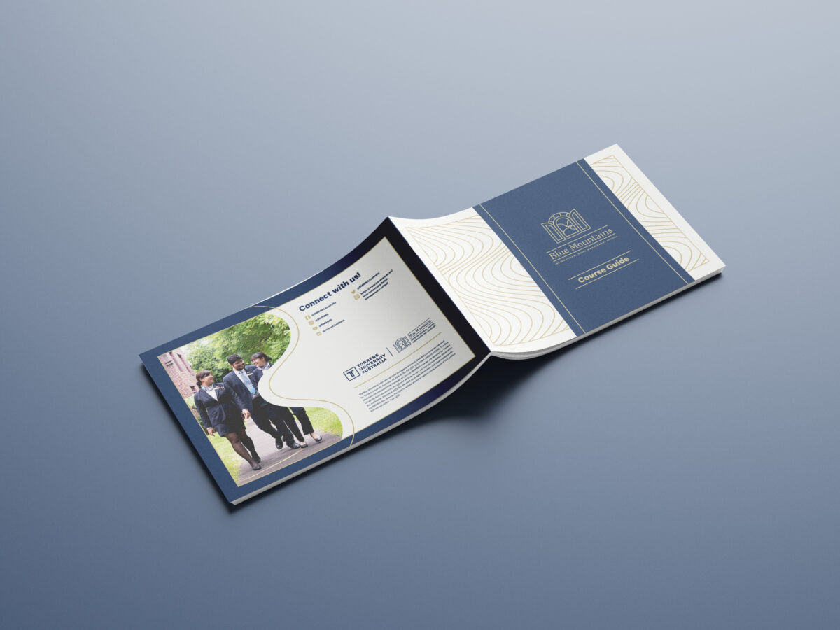
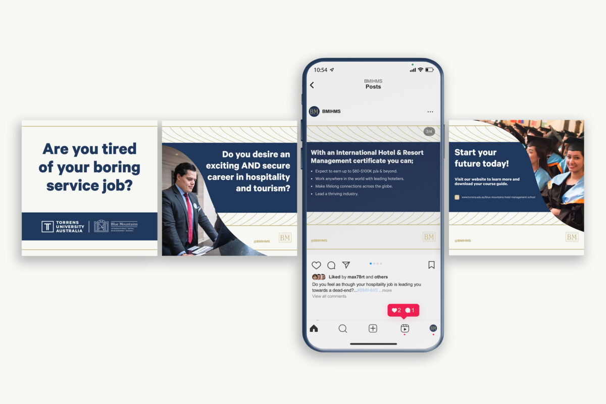
The Blue Mountains International Hotel Management School project was completed as an assessment for my diploma. In this project I was required to develop 2 initial brand direction concepts, with the better of the 2 then being developed into a rebrand. BMIHMS is a hotel management school that is 1 of Torrens University’s 2 power brands along side Billy Blue. BMIHMS was interested in a brand refresh with hopes that they would be able to find a voice that stands independently of Torrens whilst also looking good alongside it. The deliverables for this project were a brand refresh complete with responsive logos, brand colours and a secondary brand language, an A3 brand style-sheet and 4 proof-of-concepts that would demonstrate the brand in use.
Through research I identified a gap in the market for Hotel Management brands that offer real security and connection. With my research in mind I developed a brand solution that provides a sense of openness, security and opportunity whilst tying back in with the field of hotel management. I used the visual metaphor of a doorway to represent all of these elements and developed a soft and sophisticated brand language to support these goals.