Hi, I'm Sameer (also known as Sizzle). ✌🏼🤠
I'm a graphic designer based in Western Sydney. 📍
I've got a passion for branding, typography, packaging design and illustration.
As in life, I try to take an empathetic approach in my design, always thinking of the end-user, how my design makes them feel, and asking myself "what does it tell them?" 💭
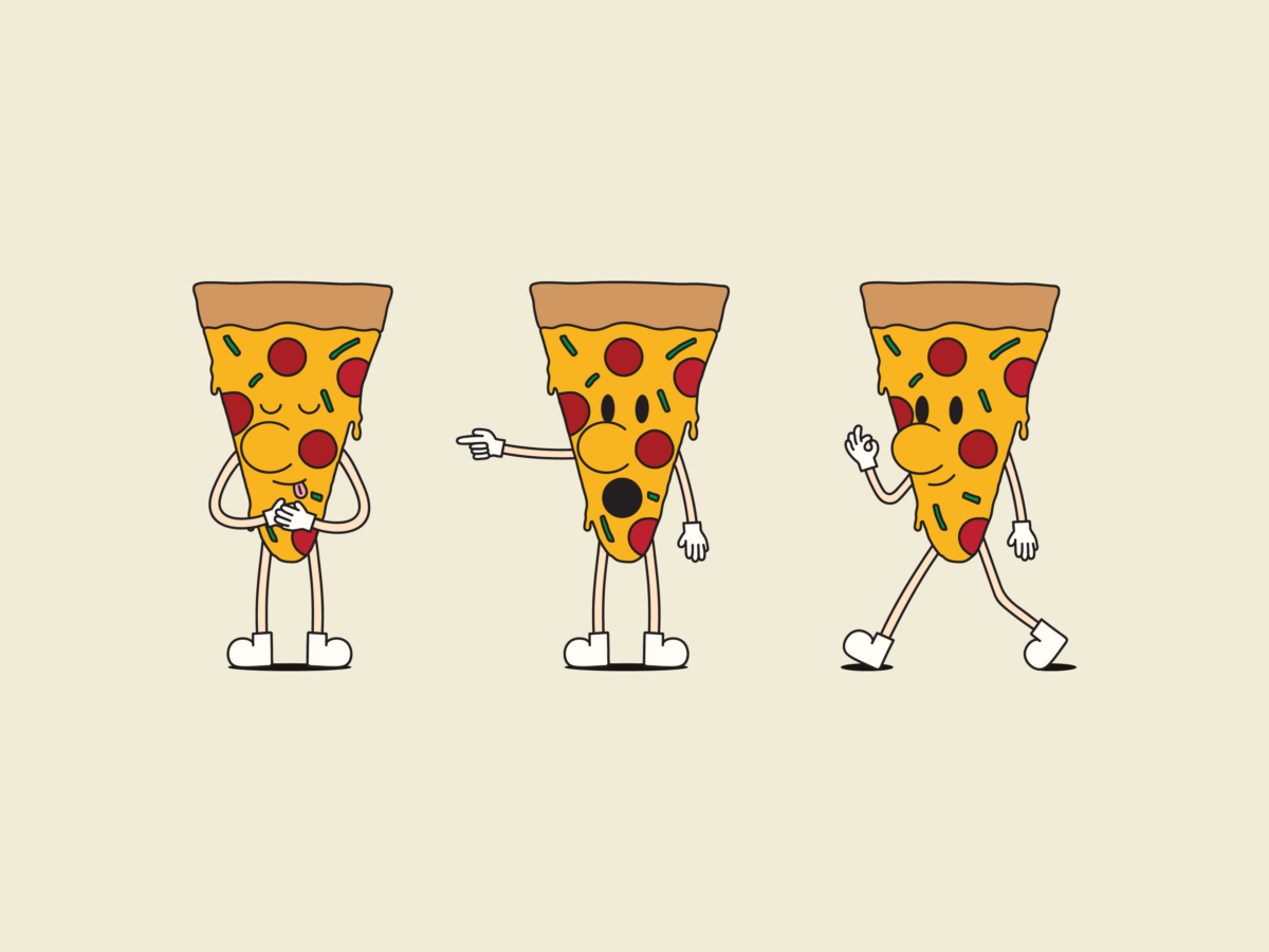
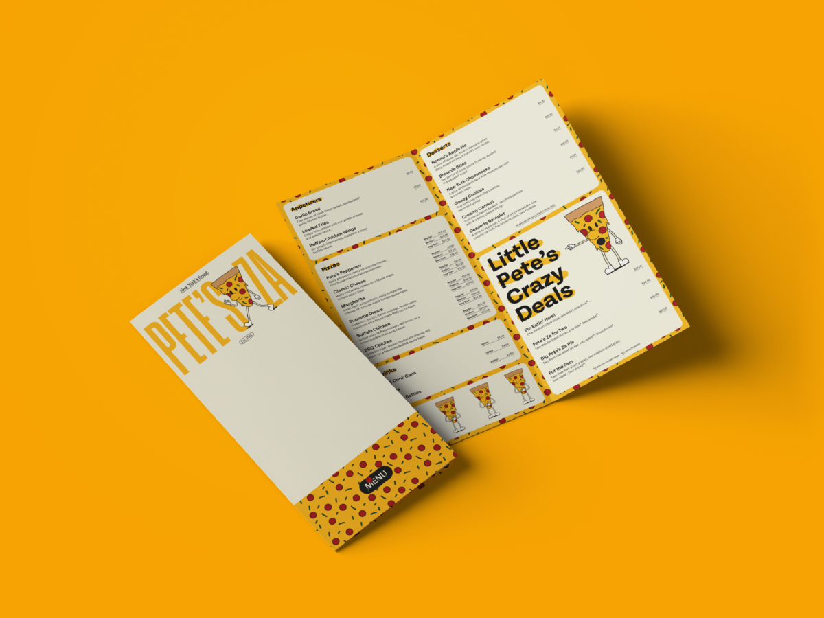
With an Italian-American heritage, "Pete's Za" offers New York-style pizza and is competing against the likes of Pizza Hut and Domino's.
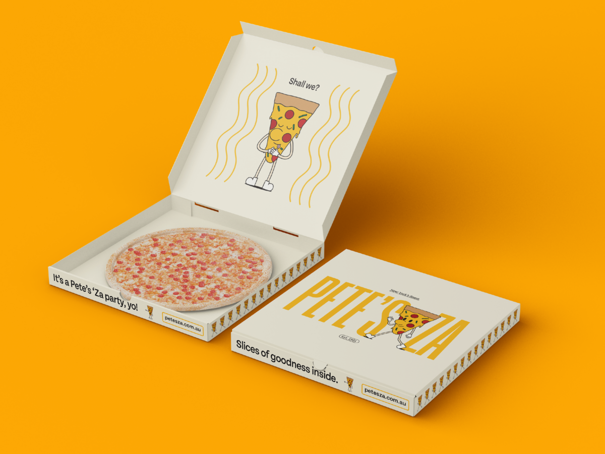
Upon researching, I found that colour is strongly used in these competitors' logos and branding. I also found that the packaging design for their pizza boxes is fairly tame. Already, I began to see how I could differentiate Pete's Za as a brand.
Based on this research, I used a bold yellow colour, a condensed typeface for the logo, and an illustrated mascot (Little Pete). Little Pete adds a "face to the name" and allows customers to form a warm and friendly connection with the brand, further differentiating Pete's Za in its sector.
I combined these elements across the packaging design for Pete's Za's pizza boxes and the menu, allowing me to create a brand that is not only memorable, but friendly and distinct, all while portraying its New Yorkian origins.
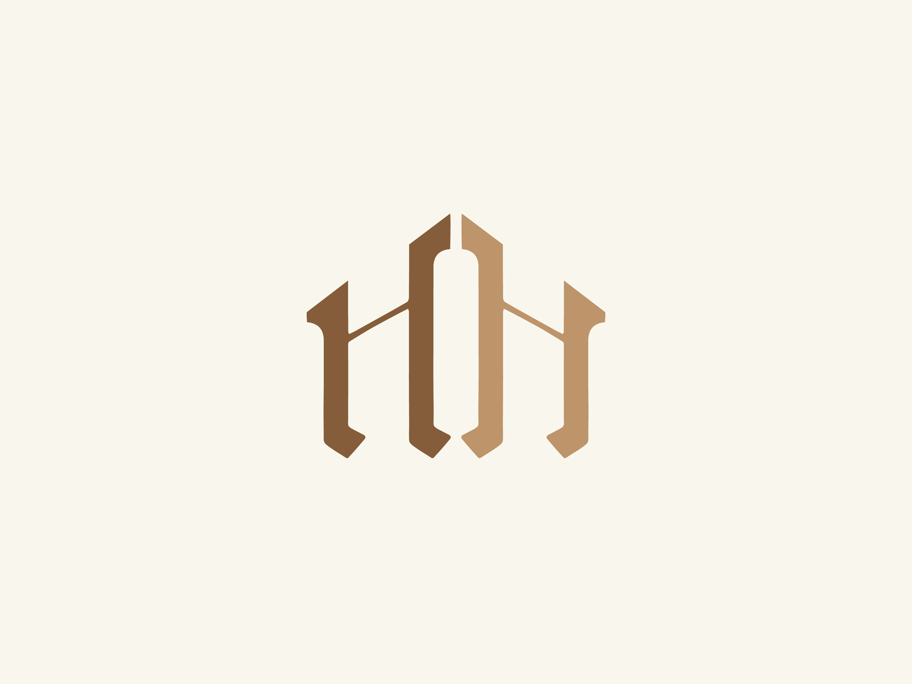
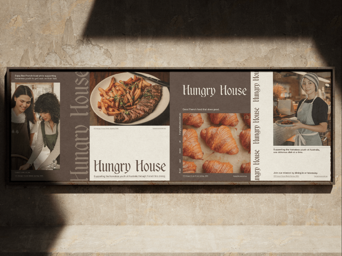
Hungry House is a 100% non-profit social enterprise that caters for homeless youth (aged 15-24), providing them with accommodation, counselling, career-related help, and a skills program.
Hungry House occupies a three-storey building in which the first floor is a French restaurant (as it is the most fundamental cuisine for learning cooking in the western world, so students learn transferable culinary skills), and the second and third levels are accommodations for homeless youth participating in Hungry House.
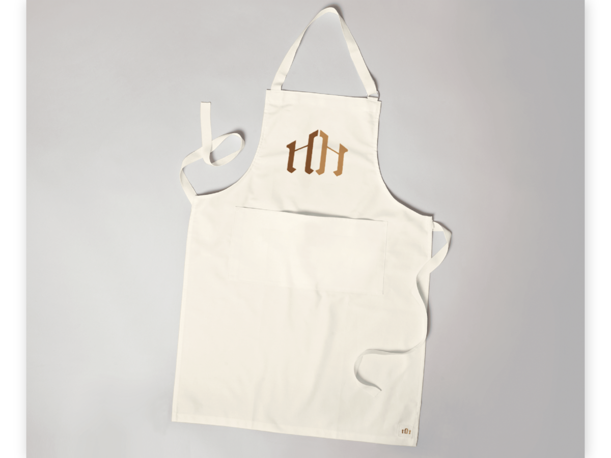
For the branding of this organisation, I chose to incorporate a more upscale feel as one would find at a gourmet French restaurant - using brown, gold, and cream colours throughout, which are also commonly found in French food. I used a serif typeface to emphasise this feel, along with a submark made using the "H" found in the logotype, which resembles a house.