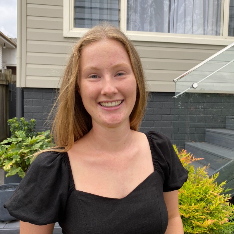
Heya! I’m Meg, a graphic designer, adventurer and go getter from Sydney.
I thrive on designing with purpose and I’m always on the lookout for new opportunities & experiences to learn and grow as both an individual and designer. I’m a optimiser thinker who is passionate about creative innovation, packaging, graphic design and baking.
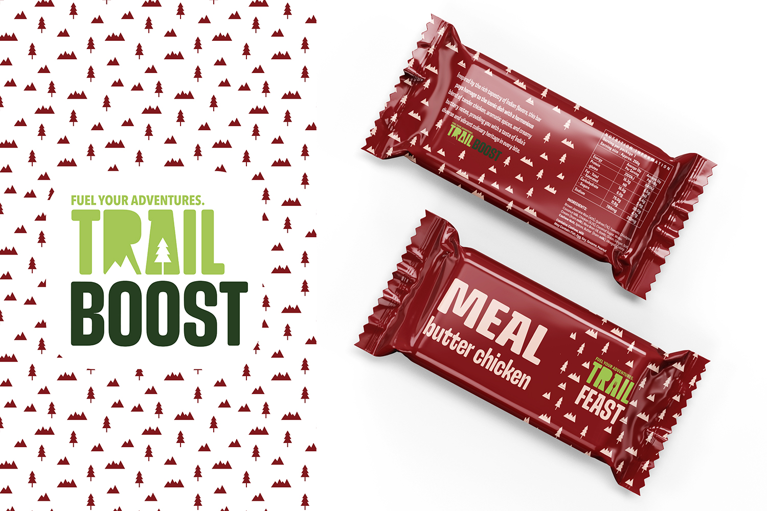
In groups of two, we were tasked with finding Kathmandu a new and innovative way to expand their business empire and improve consumer experience.
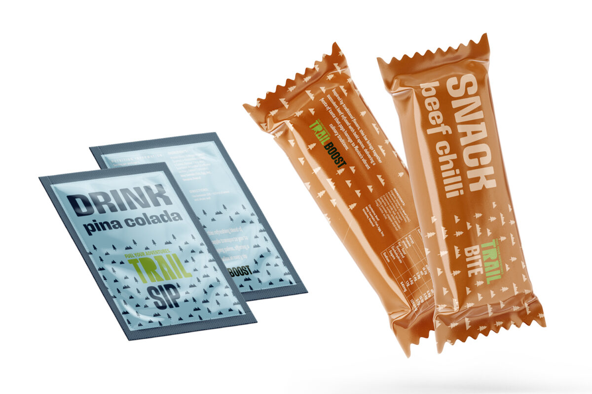
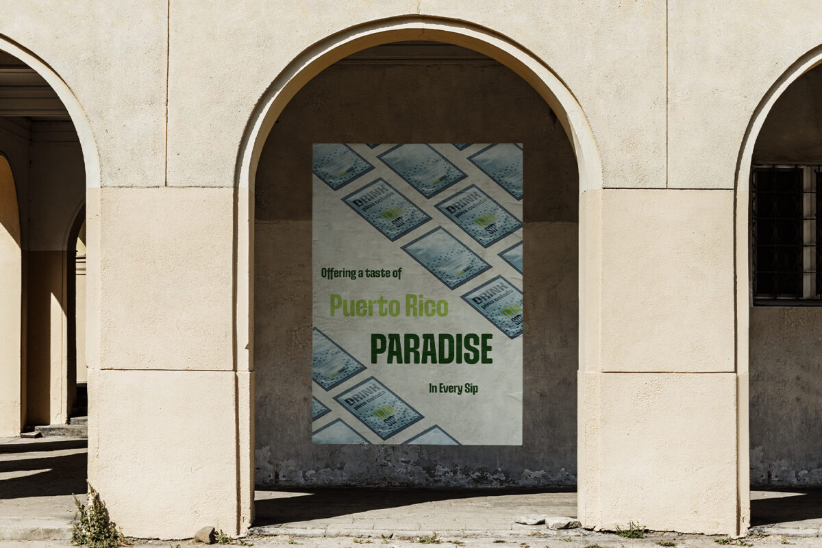
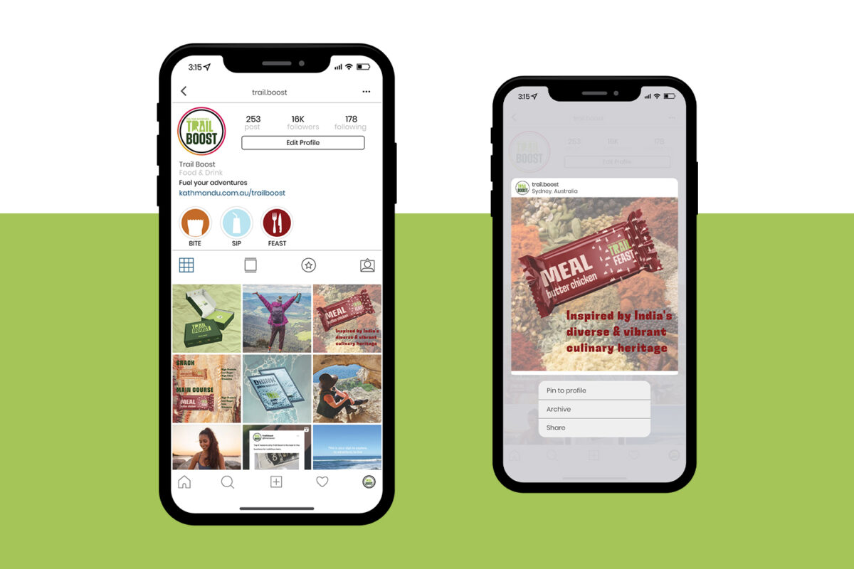
Expanding into food and beverages, allows Kathmandu to occupy a gap in current the market. This new sub-brand, Trail Boost, enables individuals to meet all the required nutritional and health requirements in one compact item which fuels their adventures and keep them maintained for a long- lasting time. This project allowed exploring the demand for substantial and sustainable products for the adventurous consumers that shop at Kathmandu.
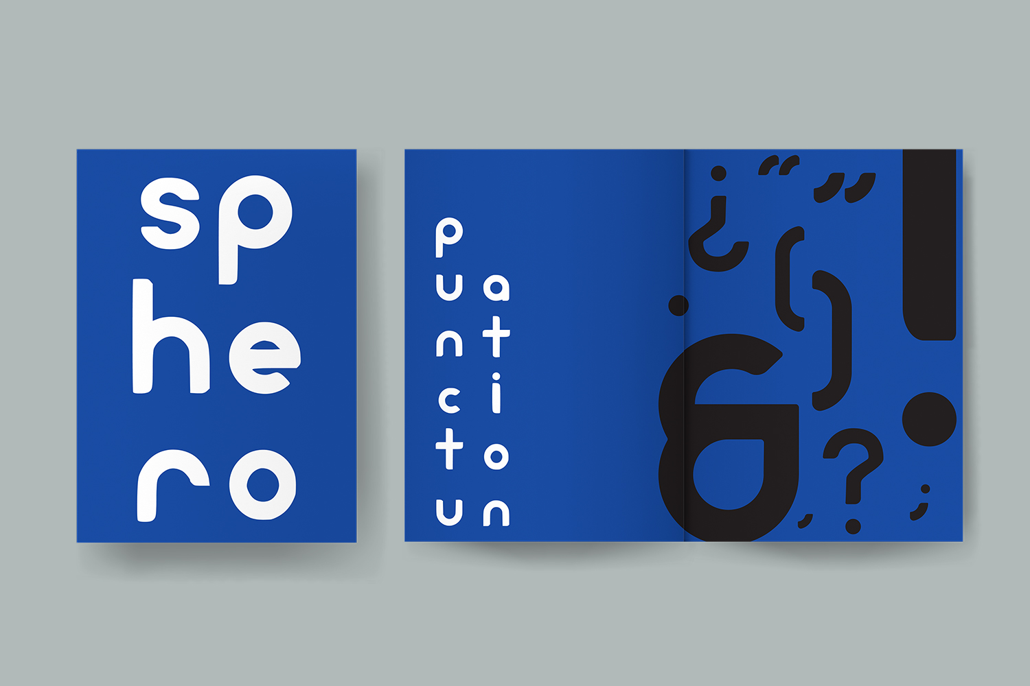
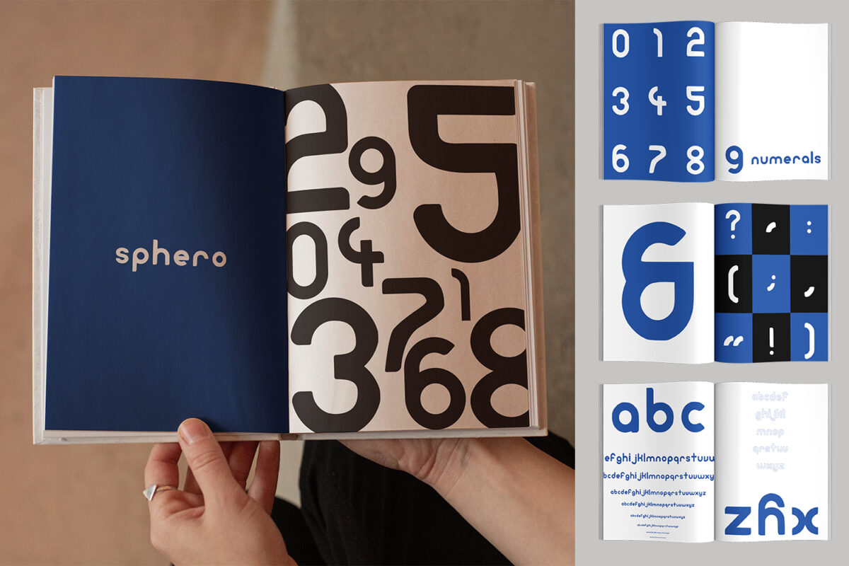
Creating a typeface to my liking, I tasked myself with using the circular shape of a circle as the base structure for all letters, numerals and punctuation.
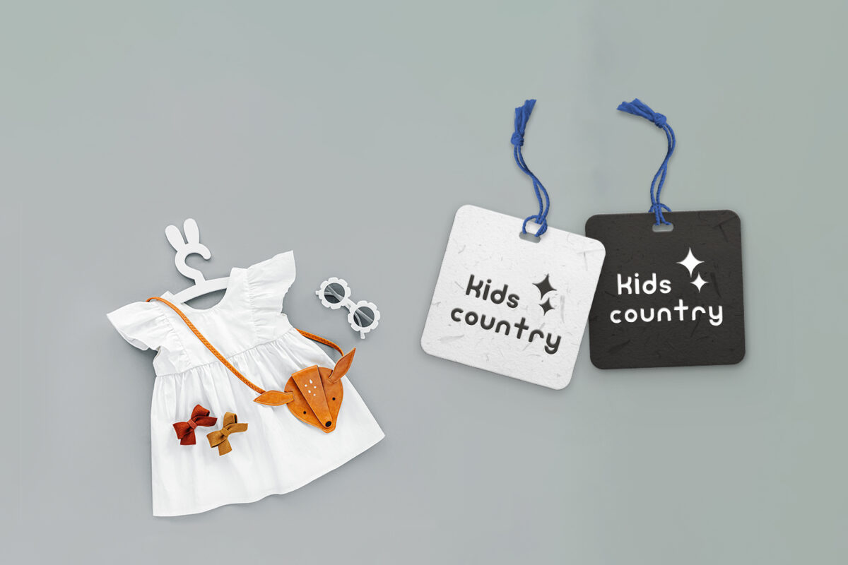
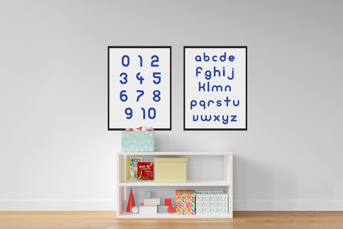
Utilising both pen & paper and Adobe Illustrator, while considering issues of readability, legibility and versatility, a new typeface was created. Based upon the synonyms of; bubbles, clouds, ball and playful, the new typeface is dynamic and soft. The typeface is able to express its sense of soft and playfulness, ready to be used by a local café or a kid’s apparel business. The finalised typeface exceeds the full lowercase alphabet, numerals and basic punctuation needs.
