Hi my name is Caroline, a fresh graduate designer from Brisbane. I am an extroverted/introvert with a background in visual merchandising. I bring a passion for visual storytelling and a keen eye for detail to every project. As an avid reader, lover of books and all things print publication I would love to grow my design skills within the publishing field, both in digital and print. I also enjoy logo design and creating visual brand identities for clients. I am eager to contribute my creativity and problem-solving abilities to help drive successful visual communication strategies.
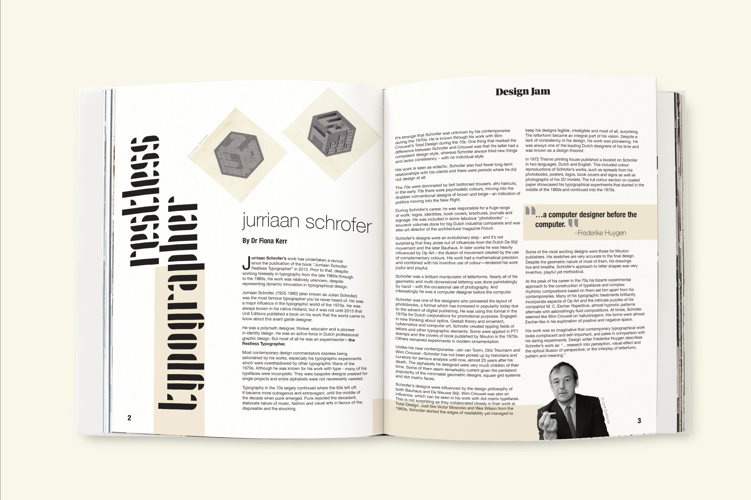
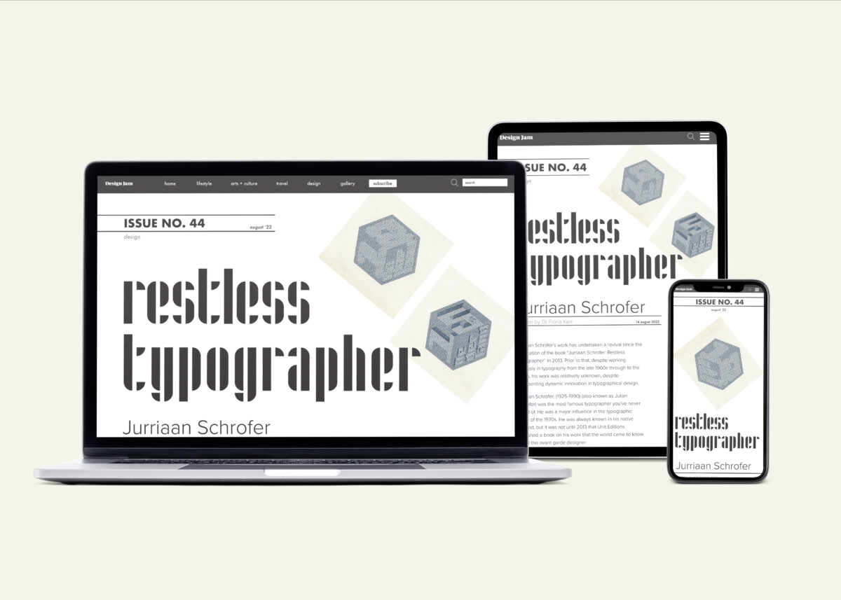
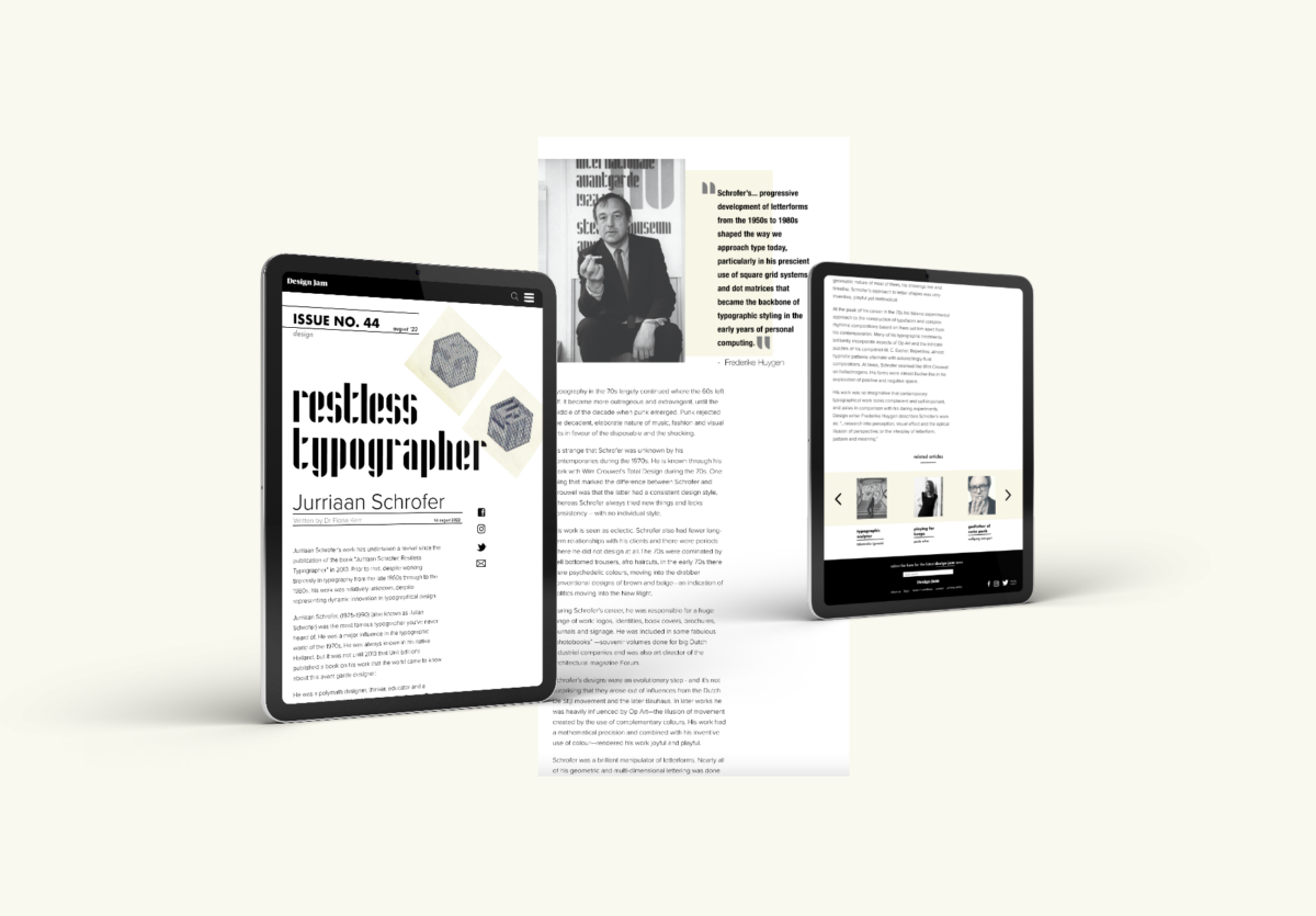
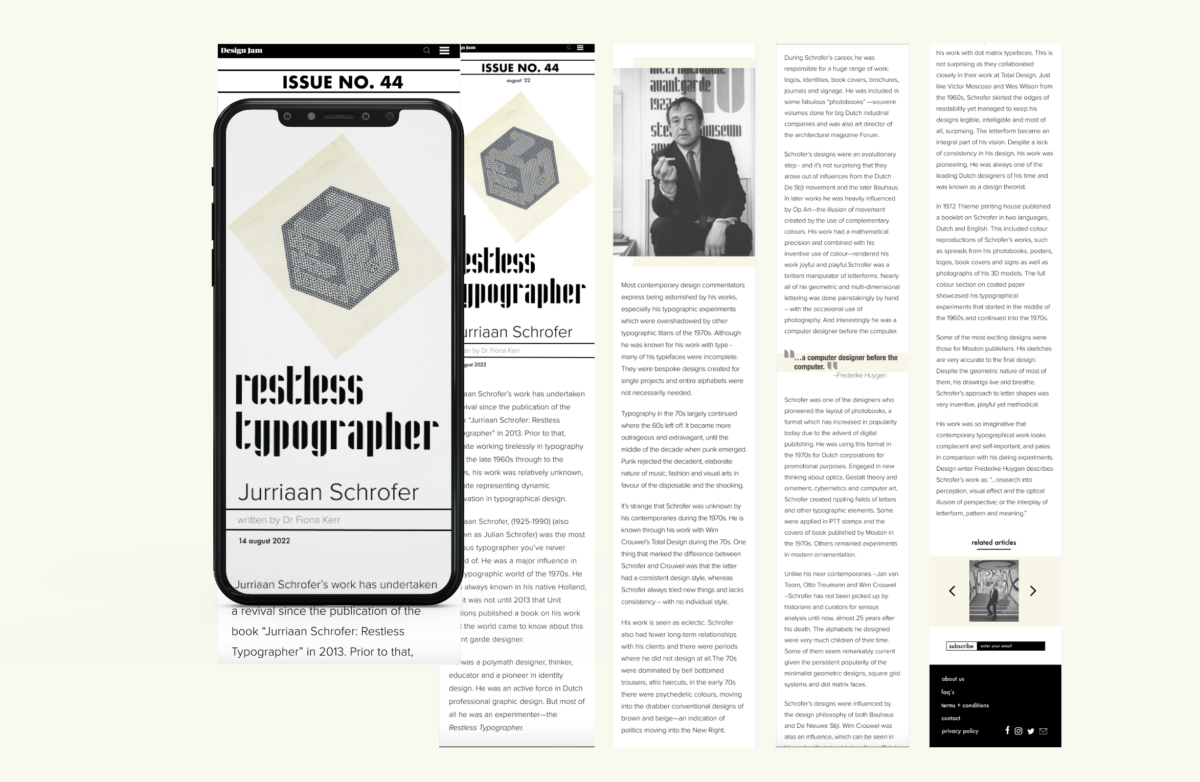
For this brief we used InDesign to create a double page spread for a print magazine. Applying the principles of paragraph formatting, advanced typographic detailing and page architecture. Adding to the print spread we were to design an adaptive layout for digital platforms, to be viewed on desktop, tablet and mobile devices.
I chose acclaimed Dutch typographic designer, Jurriaan Scrhofer for my article. Taking inspiration from the experimental designer for my layout I kept my design clean and minimal.
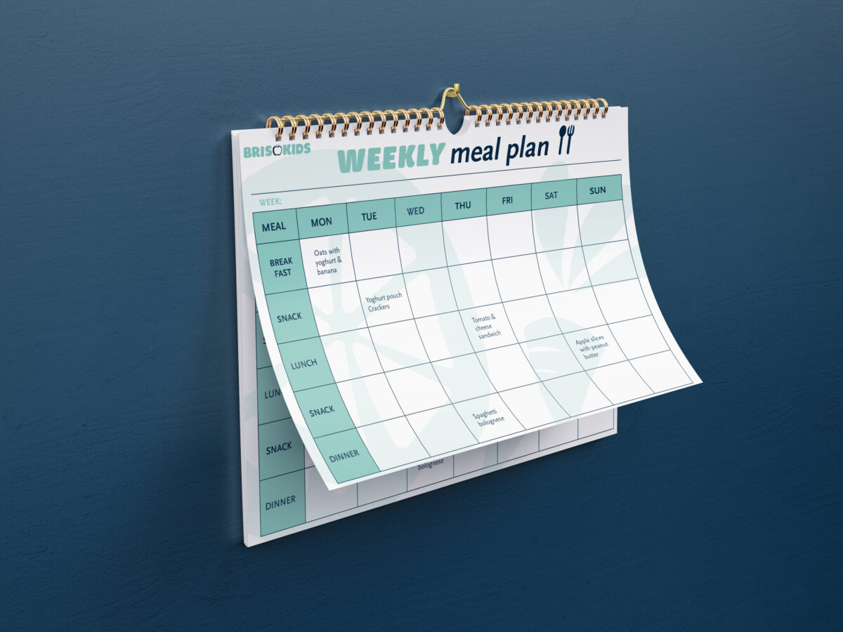
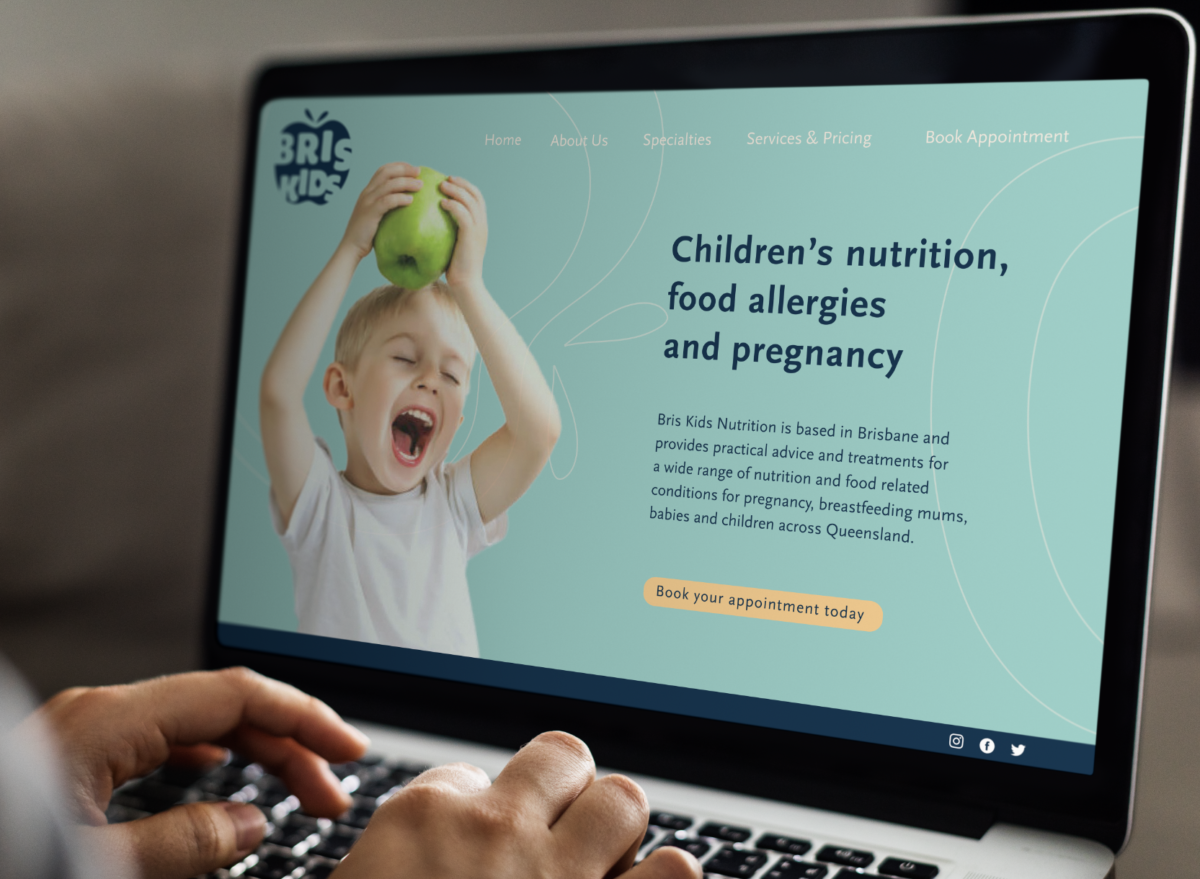
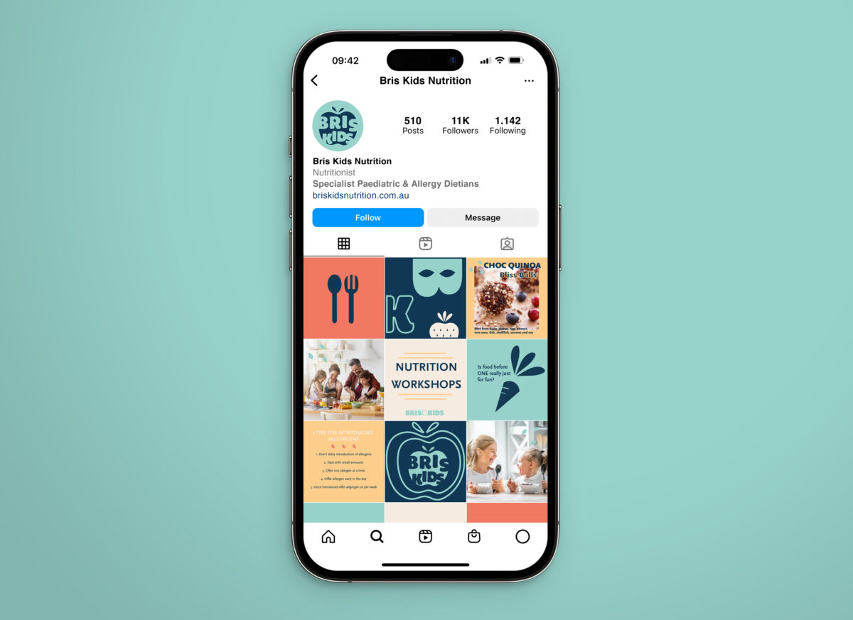
The brief required us to choose a local service provider and design a new visual brand identity for them. I chose Bris Kids Nutrition. Based in Brisbane, they provide nutrition and dietetic advice and treatments for parents with children who have a wide range of allergies and dietary conditions. They also provide nutritional advice to early childhood and care providers. Not only did we need to create a dynamic identity including logo and supporting materials but also provide a mini style guide to accompany the new brand design guidelines which can be viewed in my portfolio.
