My name is Georgie Ayers and I am originally from Tasmania. My design approach centres around creating tailored interiors that truly reflect the personalities of the owners whilst enhancing their lives. My strengths lie in pushing creative boundaries to create functional yet beautiful spaces. I look forward to applying and expanding my skills and knowledge towards the future of interior design.
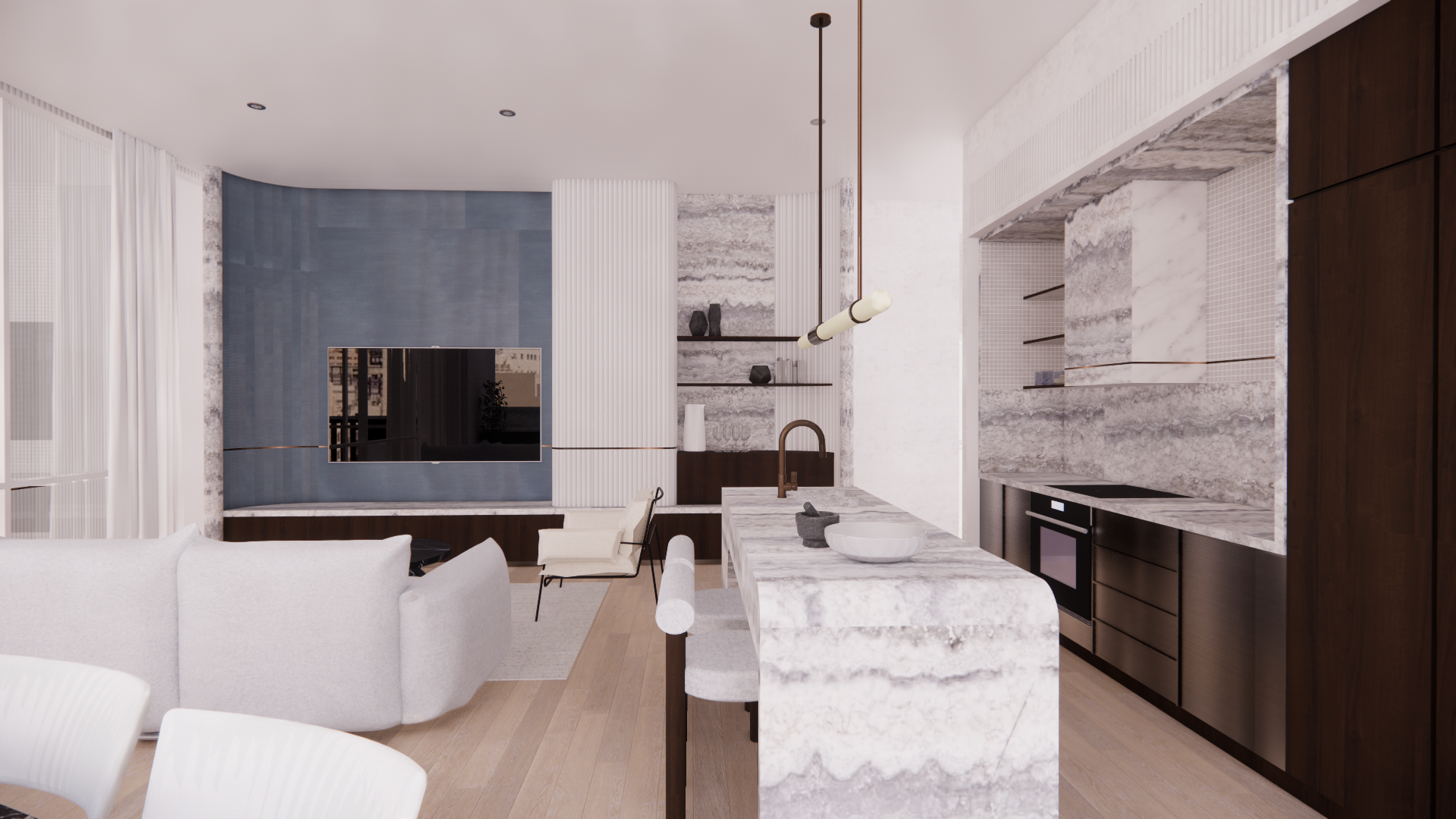
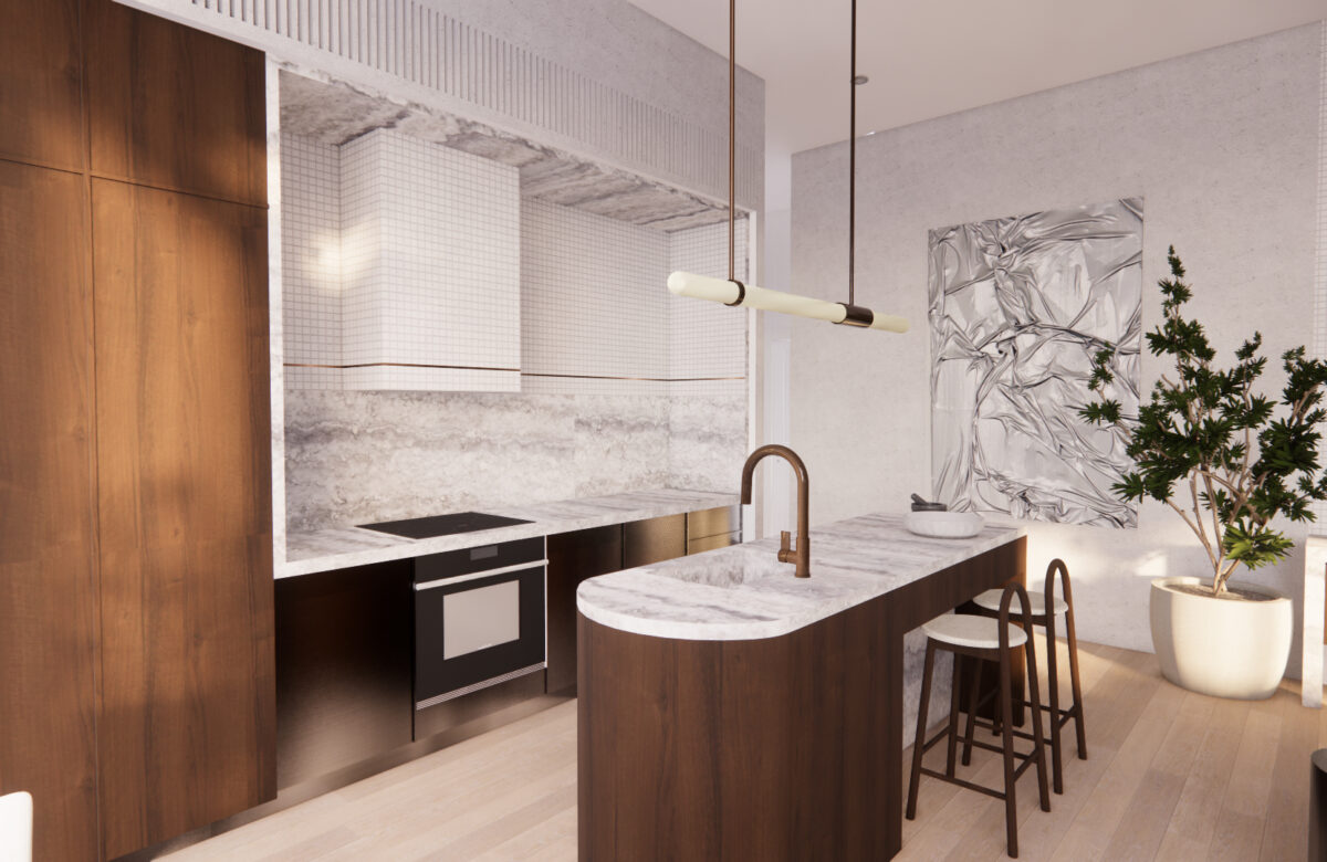
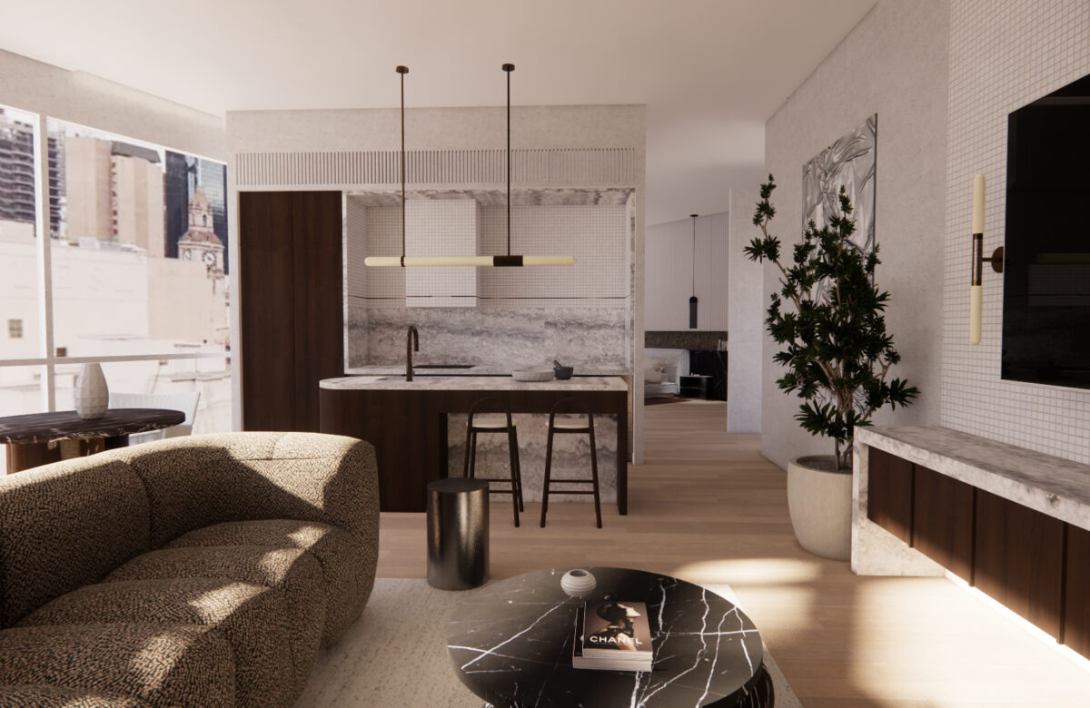
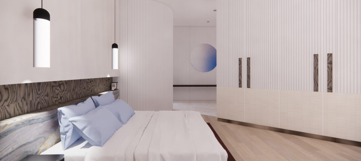
The Mnemosyne keyed back-to-back apartments have been thoughtfully designed to be used individually or as a collective. Fluted glass wall panelling has been acoustically double glazed and cascading floor length curtains are utilised to separate these spaces whilst retaining that important connection. These panels neatly tuck away contributing to a sleek and seamless aesthetic in order to open up and connect the adjoining apartments. The spaces have been designed with open-plan living in mind, facilitating seamless circulation suitable for entertaining, be it privately or between the two apartments.
The spaces evoke a feeling of luxurious tranquility that provides visual stimulation without overwhelming the senses. An array of natural stone and marble was selected to symbolise luxury, influsing the space with interest through it’s inherent colours and veining. Light oak flooring and contrasting walnut timber cabinetry strike a harmonious balance. Dedar’s Amoir fabric with it’s distinctly random, pattern repeats gracefully adorns the walls, enhancing the overall ambience and sensory delight.
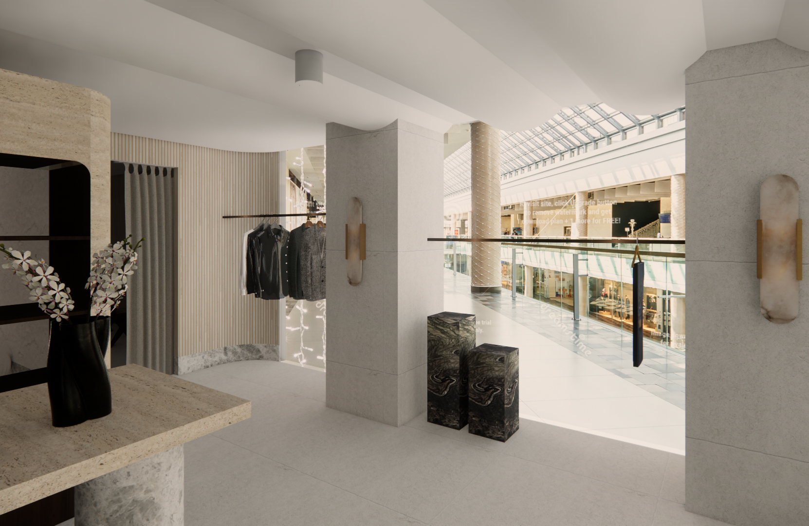
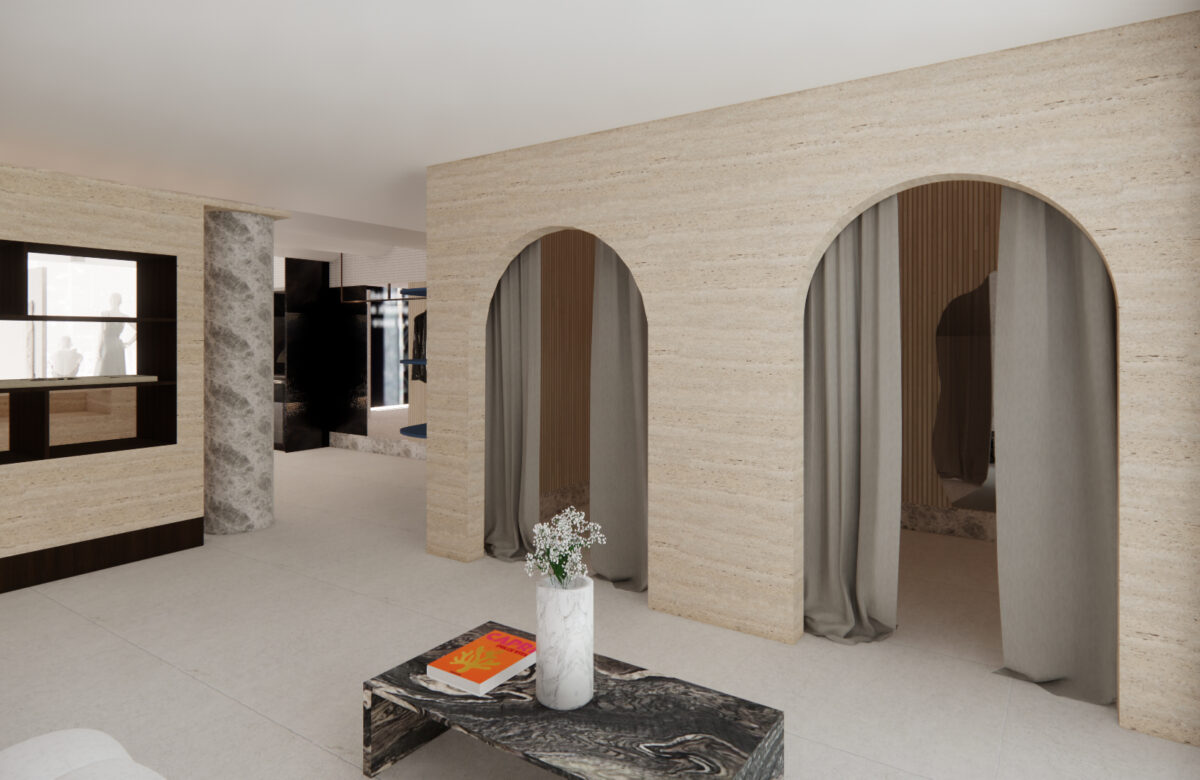
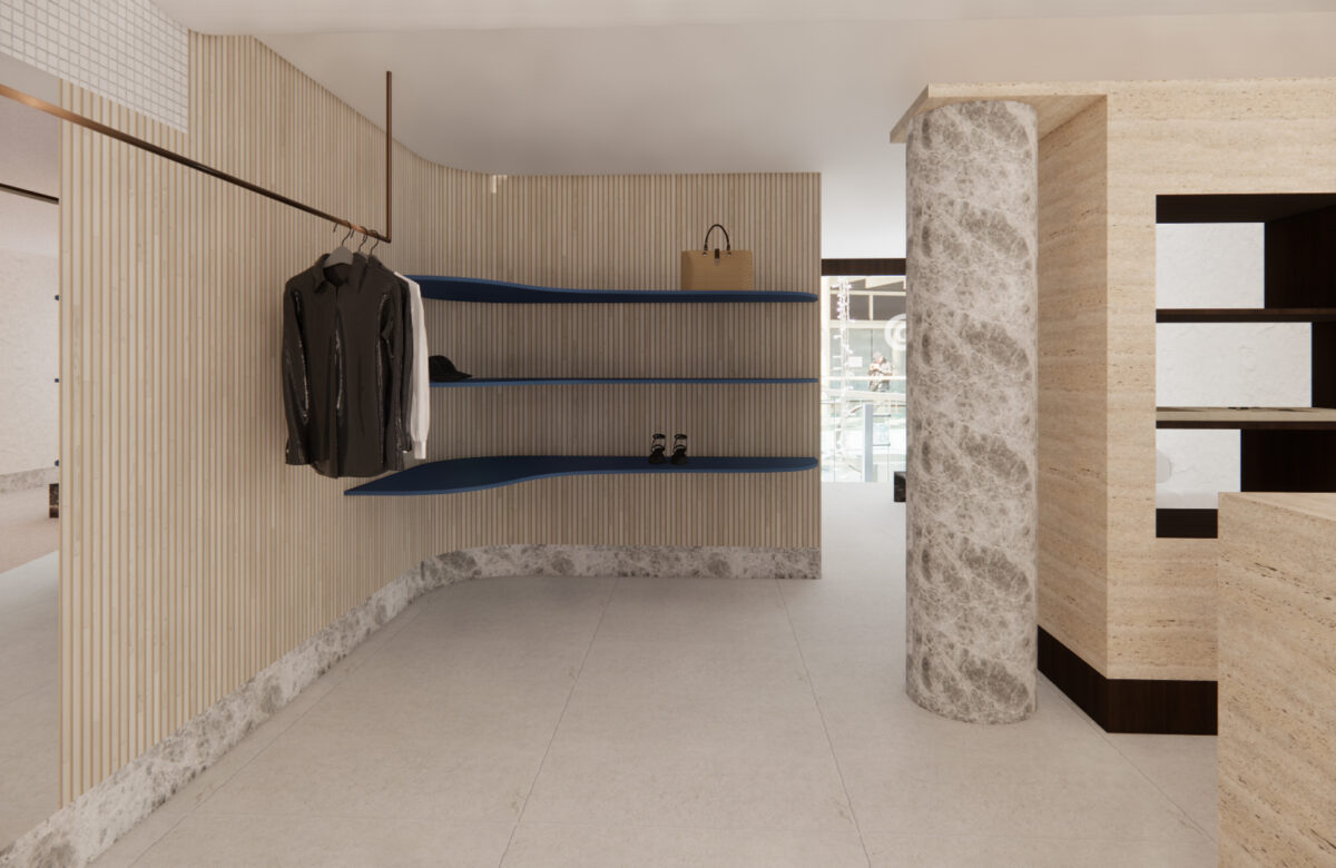
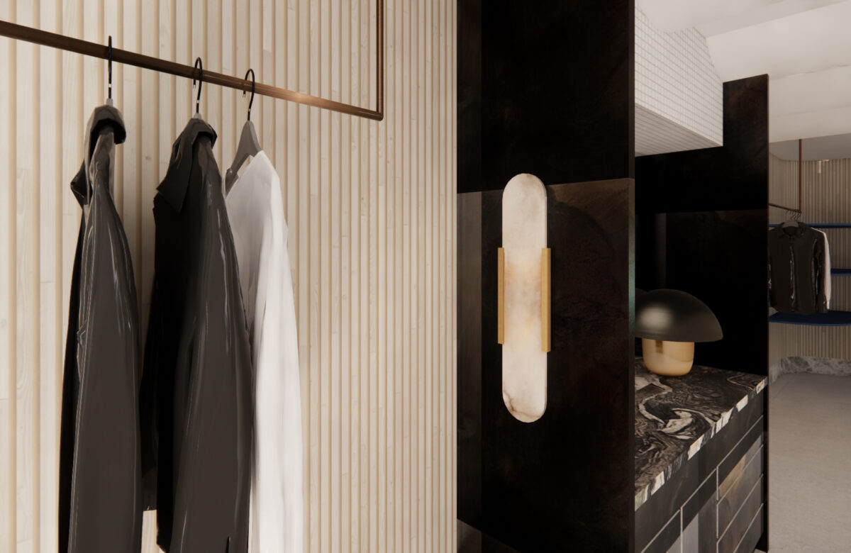
The overall design concept for Viktoria and Woods' Emporium retail space is a balanced combination of sophistication and edginess, aligning with the brand's minimalist and contemporary clothing range. The focus centers on creating a minimalist and contemporary space that effortlessly captures the consumer's attention as they move about the space.
With a palette composed of meticulously selected premium materials, an elevated interpretation of the brand is achieved. Natural stone skirting boards and accent furniture add a timeless touch of elegance, while walnut, reclaimed timber incorporated into the store's POS counter brings warmth to the space. The blackened steel wall cabinetry provides a contemporary and textured element, adding a sense of modernity to the store.
Through these carefully curated materials, the brand's essence is reflected and elevated, aligning seamlessly with Viktoria and Woods' signature aesthetic. When combined, they culminate in a unified and memorable experience for customers as they journey through the store.
